
Repetition & rhythm: RESENE
While there will always be artistic styles that experience waxing and waning popularity, the artwork you choose for your space should feel very personal. Whether you opt for an investment piece or simply want to display something that holds sentimental value, the key is picking something that really speaks to you – or something you at least enjoy looking at.
Styling by Kate Alexander | Photography by Bryce Carleton
Once you’ve found a piece that you really love, why not use it to inspire a colour palette for the room in which you’ll be hanging it?
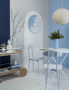
This modern garden room or conservatory features an original artwork by Hannah Jensen, one of many artists who paints her works using Resene products.
If you are unsure what colours are used in the artwork you own, you can always upload a photo or scan of your piece to the Resene Colour Palette Generator, www.resene.com/palettegenerator.
The generator creates a Resene colour palette based on the most common colours in the image and advises a proportion for colour use.
From there, you can download swatches to start fleshing out your design scheme.
One clever idea is to use the shape of your artwork to create similar shapes on your walls.
In this space, an arch has been painted in Resene Alabaster over a background in Resene Flotsam. Then, repeat the same shape throughout the room to create a sense of continuity.
Here, the rice paper lantern, the table, the vases and the wheels of the cart carry the theme throughout the space. In the same way round shapes have been repeated, so have colours.
The wall at the right in Resene Polo Blue and the vase on the table in Resene Time Out bring the main colour of the artwork further into the space.
To bridge the gap between the lightest colour in the room (Resene Alabaster), the darkest colour (Resene Bunting) and the grey of Resene Flotsam, Resene Link Water was used on the chairs, small vases and plant pots to link together the entire colour palette.
And, the decision to stick to a tonal scheme gives the artwork more visual space to shine.
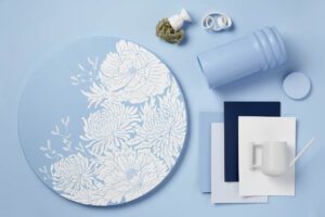
*BoConcept Sydney Trolley in Oak Veneer, Jardin White Bistro Table, Spotlight Glass Buddha Sculpture and Bouclair Modern Nature Vase, Kmart tin and vase in Resene Polo Blue, Father Rabbit garden tools.
Get inspired at your local Resene ColorShop, www.resene.co.nz/colorshops.