Autumnal colours
This autumn, Dulux looks to comforting colours to create a rustic-luxe style. Think natural colours, mid-tone timbers and simple yet sophisticated styling. This year it’s all about retreating in doors and creating a cosy, yet joyful space to both nurture and inspire.

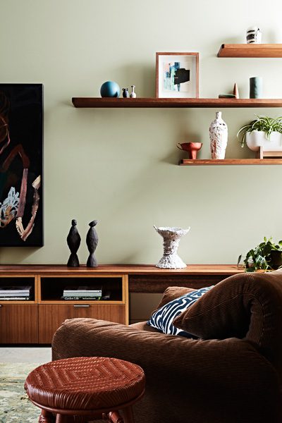
Soft grey-green is a palette that combines the best of nature. It is this season’s ‘new neutral’. Pairing well with dusky pinks, olives, rich deep blue-greens and ochre, it creates a sumptuous, but grounded, indoor natural autumn haven.
Four colour palettes from Dulux this year reflect on the societal trends of wellness, rejuvenation, environmental awareness and mindful consumption. ‘Repair’ is one of these key palettes – which includes rich green with accents of burnished gold – that draws from nature to comfort and uplift, while allowing us to slow down and reconnect with the natural world, says Dulux Colour Specialist Davina Harper.
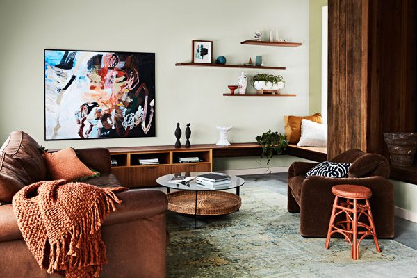
This perfect autumn palette beautifully offsets interesting spaces and décor pieces that tell a story. She says striking combinations, such as verdant green, chocolate, umber and sienna set a playful, optimistic tone, while the soft, green-based grey is the neutral pairing with these nature-based hues.
This autumn will see layering of natural colours and textures such as richly grained warm timber, time-worn buttery leather, cork and tactile velvets. They go well with handcrafted and vintage simple pieces. On the other end of the autumnal colour spectrum, rich green or blue-green is fabulous for feature walls – creating a bold look. Concrete effect paints, for table tops to planters, also add a natural organic rawness to the muted autumnal tones.