
Colour me Clever
Pantone announced Ultra Violet as the colour of the year for 2018 and it’s continuing to play a starring role in every aspect of home design. But if you’re already looking ahead to 2019, the word on the homewares street is that ‘Cravings’ and ‘Classico’ colours will be the lay of the decorating land.

Pantone announced Ultra Violet as the colour of the year for 2018 and it’s continuing to play a starring role in every aspect of home design. But if you’re already looking ahead to 2019, the word on the homewares street is that ‘Cravings’ and ‘Classico’ colours will be the lay of the decorating land.
The Pantone Color Institute has highlighted these two palettes from the opposite sides of the colour spectrum as the ones to look out for in 2019.
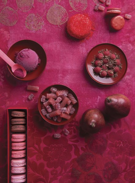
The shades in ‘Cravings’ are meant to tempt the eye as well as the taste buds, featuring “spicy reds, sweet flamingo orange and rich purples”.
The depth of “fetish foods” such as peppers and chocolate, are tempered by the warmth of a neutral cappuccino shade and a grassy green shade. Think bright red statement furniture and all the goodness of maximalist joy.
Meanwhile, the hues of ‘Classico’ skew more towards the elegant, with a nod to style fundamentals. Featuring much more classic neutral tones, it is the palette where “a graceful swan white” and shades of camel pair perfectly with deep teals, grey flannels, burgundy reds and caviar blacks.
So go wild, the world is your colourful oyster.