

Colour me calm
It was Australian writer/organiser Peter Walsh that once said, “Your home should be the antidote to stress, not the cause of it”. And never a truer word has been said.
While we continually seek to de-stress outside of the home – taking a walk, heading to the gym or joining a yoga class – leaving the house is not actually integral to feeling happier and lighter. Why not make a sanctuary of calm right at home?
The Dulux Colour Forecast has just been released for 2019 offering tonal, saturated and contrasting palettes to nurture, recharge and empower. In recognition of colour’s powerful ability to dramatically transform a space and help create a specific vibe, we’ve taken the opportunity to look at the most calming options on the colour wheel.
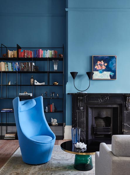
When it comes to relaxing colours, blue has the power to calm your mind, slow down your heart rate, lower your blood pressure and reduce anxiety.
Symbolising nature, green is one of the most restful and quiet colours, helping you stay calm and refreshed. Pink is another colour that promotes tranquillity and peace, with the rules of Feng Shui deeming this talented tone as capable of soothing competing energies within a space.
White symbolises tranquility and freshness, giving clarity of thought in times of stress. With the capacity to bring balance and inner peace, violet signifies peace and wisdom. While at face value, grey can be considered dull, it’s actually very soothing, making the perfect partnership with blue tones.
To learn more about Dulux’s 2019 Colour Forecast visit www.dulux.co.nz.